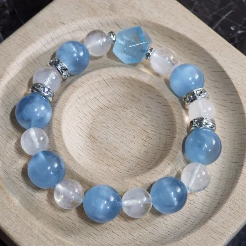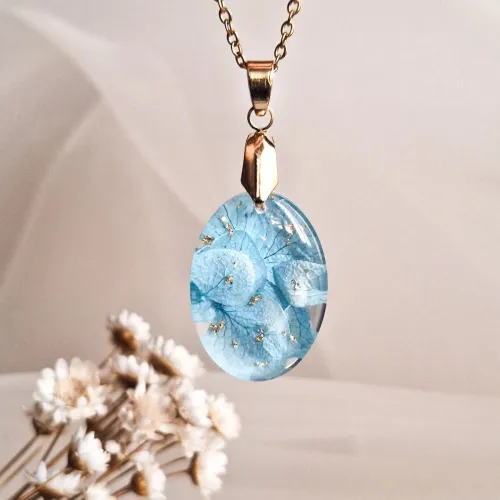
When pairing gemstones with aquamarine, many encounter conflicting advice - some insist diamonds are the only match, others recommend contrasting bright colors, and durability concerns often get overlooked. This confusion stems from fragmented information about color theory, physical properties, and practical design principles. We'll systematically clarify these aspects using jewelry science fundamentals, examining how light interacts with different stones, what structural combinations prevent damage, and why certain pairings withstand daily wear. By breaking down eight key considerations from hue harmony to setting mechanics, you'll develop a practical framework for evaluating gem compatibility that transforms overwhelming choices into logical decisions.
Jewelers often suggest "matching blues" for aquamarine without specifying undertones, leading to pieces where stones clash due to warm/cool discrepancies. This happens because aquamarine sits uniquely between blue and green spectrums, making simple color matching unreliable. The recommendation emerges from incomplete color theory applications where hue gets prioritized over temperature.
Technically speaking, gems with analogous blue and green tones create cohesive visual harmony as they share comparable light wavelengths. For example, blue zircon or green tourmaline may blend seamlessly when their saturation levels align with the aquamarine's subtlety. Cool-toned white diamonds can brighten the arrangement without conflict, whereas warmer stones like citrine might create visual dissonance. Understanding this color temperature dimension helps explain why certain unexpected pairings work while similar-looking stones fail.
When evaluating potential partners, notice how the secondary tones appear under different lighting conditions. Hold candidates beside your aquamarine near a window first, then under artificial light. Consistent compatibility regardless of lighting indicates color temperature alignment. Also observe how the stones interact - they should enhance rather than compete with each other. If one consistently outshines or dulls the other, reconsider the pairing regardless of initial visual appeal.
Many sources label diamonds and sapphires as "go-to" partners for aquamarine but rarely explain why these classics endure beyond tradition. This advice typically comes from historical precedents rather than technical analysis, causing skepticism about whether older guidelines remain relevant today.
In reality, these traditional choices persist for engineering reasons beyond mere aesthetics. Diamonds and blue sapphires rating above 7 on the Mohs scale resist scratches during regular wear, matching aquamarine's durability. Princess-cut diamonds specifically maintain proportionality alongside standard aquamarine faceting patterns due to similar light reflection angles. Their refractive index compatibility also minimizes visual disharmony under multi-directional lighting. These scientific compatibilities create inherent longevity that newer pairings must replicate.
Analyze any proposed pairing's essential characteristics beyond appearance: Check each stone's Mohs hardness difference (shouldn't exceed 1.0-1.5 points) and compare standard cut proportions. Notice how textures play together - diamond accents in shared claw settings help prevent differential wear by securing all stones equally. Research each material's refractive index; differences exceeding 0.08 may cause distracting light variations in finished pieces.
Modern designers promote "unconventional" stone combinations but occasionally neglect structural realities in favor of visual impact alone. These artistic recommendations often originate from runway trends where jewelry experiences minimal long-term use, yet get presented as everyday options.
The clearer way to see it is through engineering-informed design: symmetrical arrangements create balanced aesthetics in multi-stone compositions regardless of material choices. Milgrain detailing softens transitions between stones without dulling reflections, while pavé settings distribute weight evenly across the jewelry piece. Structural approaches like channel settings protect stone edges from impact damage during use. Modern pairings succeed when these technical safeguards integrate into innovative layouts.
When considering trendy stone combinations, prioritize structural support questions first: How will softer accent stones receive protection? Bezels provide extra security for materials below 7 hardness. Does the setting type distribute mechanical stress? French wire constructions manage kinetic forces effectively across components. Finally, examine sightlines - tension settings preserve unbroken light paths around paired gem perimeters. Documenting these factors makes modern pairings both adventurous and practical.
Anecdotal advice like "trust your eyes" leads to poor pairing decisions when sensory impressions clash with material realities. Physical incompatibilities become apparent over weeks or months but remain invisible during initial assessment.
A systematic approach requires three evaluation dimensions: Light performance (how reflections interact), durability benchmarks (hardness and toughness comparisons), and structural logic (whether settings accommodate material differences). For instance, rhodium-plated components prevent oxidation that causes visual inconsistency between metals. V-prong clasps ensure secure stone retention over extended periods while accommodating dimensional variations between gems. These measurable criteria generate more reliable predictions than instant visual reactions.
Develop a consistent assessment routine starting from technical specifications: Compare both stones' Mohs ratings; gaps exceeding 1.5 points warrant protective settings. Evaluate cut proportions - mismatched facet patterns might create uneven light dispersion. Finally, anticipate environmental factors like humidity where closed-back settings protect non-graded stones from clouding. This triple-check method prevents emotional attraction from overriding physical contradictions.

Some pairings appear flawless initially but develop visible wear asymmetries within months, often because durability considerations were secondary to initial appearance. This mismatch arises when designers prioritize transient visual impact over material behavior across timescales.
In reality, daily stress demands engineered solutions: thermal shock-resistant alloys withstand ultrasonic cleaning procedures crucial for deep maintenance of multi-stone pieces. Gallery rail construction adds structural reinforcement to elaborate stone patterns preventing deformation from accidental impacts. Tapered shank designs maintain proportional thickness while reducing bulk, minimizing catch points on fabrics that strain delicate settings. Longevity isn't accidental - it emerges from anticipating how components interact during repetitive motion.
Inspect potential pieces as functional systems: Does proper crown height alignment prevent fabric snagging? Are lever-back clasps present for heavy multi-gem arrangements? Test tactile smoothness along inner bands where friction occurs. These features become critical when pairing stones with varied resistance profiles - what looks gorgeous in store might prove impractical during regular use.
Rigid "perfect pairing" rules neglect how jewelry forms impose different structural requirements. Identical stones in rings versus necklaces might demand opposite settings - a reality rarely discussed in generic pairing guides.
Practical adaptation requires understanding kinetic differences: Rings endure continuous impacts, favoring bezel or channel protections. Pendant designs mainly confront gravitational stress, making sturdy bails with load-bearing connections essential. Symmetrical arrangements often create balanced aesthetics in multi-stone compositions regardless of format. The pairing concept extends beyond stone selection into how the physical assembly accommodates jewelry anatomy. A tension setting that illuminates stones beautifully in earrings might be impractical for bracelets subject to twisting forces.
Apply context-first thinking: For rings, prioritize compressive protection and knuckle clearance; necklaces need pendulum rhythm; bracelets require stress-distributing linkages. When pairing materials, harder stones should surround softer ones in arrangements where the dominant direction of force directs pressure toward durable elements. This dynamic approach outperforms static pairing doctrines.
The frustrating experience where paired gems look cohesive in some lighting but discordant in others reveals overlooked light behavior. Photographers' lighting tricks often mask these dynamics in marketing images.
Reliable pairing involves optical engineering: Refractive index compatibility minimizes visual disharmony under multi-directional lighting, explaining why materials with similar light-bending properties naturally coordinate. Princess-cut diamonds strategically maintain proportionality alongside standard aquamarine faceting through calculated angle alignments. Bezel settings provide extra protection for softer complementary stones while refracting light in uniform patterns.
During evaluation, create light variation intentionally: Use natural window light, then shift to warm/cool artificial sources. Notice whether both stones brighten and dim at similar rates, and how light passes between them. Place a white card beneath them - consistent under-tone reflections indicate refractive harmony. Understanding these optical conversations helps predict how pairings will behave in diverse environments.
Misconceptions persist around low-maintenance pairings, with many expecting carefree combinations that don't reflect material science realities. These expectations emerge from marketing terms like "easy-care gems" without technical clarification.
Here's how to approach frequent concerns: Bezel settings provide extra protection for softer complementary stones below 7 hardness. Closed-back settings protect non-graded stones from humidity-related clouding. Sterling silver backings prevent metal discoloration that conflicts with cool tones. Importantly, thermal shock-resistant alloys withstand ultrasonic cleaning procedures safely when jewelry accumulates grime. These approaches manage rather than eliminate maintenance requirements.
For frequently rotated pieces, implement preventive practices: Always remove jewelry before swimming or cleaning. Use soft brushes rather than direct abrasion on mixed-composition settings. Store separately if pairing includes hardness-diverse stones. These small habits preserve compatibility relationships longer than any ideal material combination. Remember that even durable pairings last only as long as their maintenance regimen supports them.
The most transferable knowledge includes recognizing the three pairing dimensions: hue relationships (analogous > matching), durability thresholds (hardness gaps <1.5 points), and refraction behavior (similar index values). Structural choices like gallery supports or proportional tapering frequently determine real-world performance. Next time you evaluate potential pairings, focus first on light performance comparisons, then stress-test setting security, ending with color temperature verification. Tracking these elements consistently develops instinctual identification of effective combinations. Progress in pairing judgment comes not from finding perfect answers but from asking better-formed questions each time you assess gem combinations.

