When exploring aquamarine value propositions, enthusiasts often encounter conflicting perspectives: some marketing emphasizes deeper color saturation as inherently superior, while others argue that origin determines worth. Casual observers can become confused by terms like "sea-green" versus "sky blue," and online discussions sometimes oversimplify the multifaceted relationship between tone distribution, color presence, and market dynamics. This analysis examines prevalent narratives about color quality measurement protocols, saturation thresholds, professional valuation considerations, and preservation methods to help build evidence-based evaluation skills using technical foundations.
Popular conversations often suggest "the deeper the blue, the better" when selecting high-value aquamarine. This perception appears logical since richer colors generally seem more eye-catching in jewelry displays and images online, leading many to seek stones visually appearing almost navy blue. Such trends stem from marketing language linking depth with exclusivity and limited visual exposure to properly graded stones across different lighting contexts.
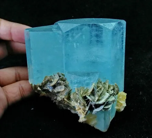
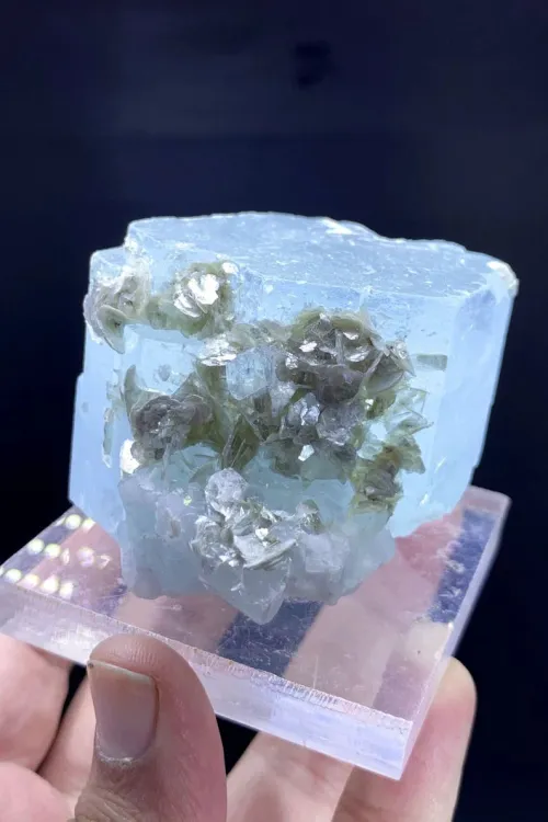
In reality, the clearest methodology examines technical characteristics. Trace iron within beryl structures forms the stone's color identity, with higher concentrations influencing hue strength. Optimum valuation typically occurs within controlled tone percentages from 65% to 80%. Stones falling below this range may lack presence, while darker examples tend to obscure light performance. When observing aquamarine options, the purest blue presentation generally receives the highest appraisal, especially without detectable green modifiers which may dilute blue wavelengths.
Next time you view potential pieces, try this approach: First, rotate the stone under consistent lighting, evaluating if blue remains dominant from every angle without green intrusions. Then, examine brightness transmission through its body - when held against white paper, overly dark stones will show dimness around edges. Finally, compare it against medium-range references, noticing how the 65-80% depth maximizes vibrancy without blackening. Documenting these observations helps build personal benchmarks over time.
Some conversations imply saturation constitutes a minor or subjective consideration. This viewpoint might originate from photographs that compress color dimensions or experiences viewing stones in artificial lighting. When comparing, individuals new to gem evaluation can occasionally prioritize immediate size impressions over nuanced color quality, potentially undervaluing saturation's role.
A more precise perspective recognizes saturation's contribution as quantifiable. Saturation intensity directly influences value, technically measured through vividness under daylight conditions using master comparison sets. Higher saturation enhances per-carot pricing structures significantly, as gems radiating stronger color projection appear more desirable. Prismatic cutting styles sometimes heighten visual saturation more effectively than step-cut designs. Additionally, face-up appearance across multiple lighting environments offers critical valuation evidence - stones maintaining saturation stability consistently generate higher appraisals.
When examining saturation performance with jewelry pieces, adopt this practice approach: Look first in morning daylight, when subtle saturation differences become most apparent. Notice how vivid stones distribute color evenly across facets without visible washed-out areas. Then move the piece indoors under warm lighting - quality saturation typically resists turning dull or grayish. Finally, hold it against your palm, observing whether color intensity stands independently rather than depending entirely on background contrast. Developing these observation skills takes practice but yields substantial analytic improvements.
Novice buyers occasionally assume color grading is intuitive or loosely subjective. Many encounter inconsistent dealer terminology like "investment blue" without transparent criteria, creating confusion. Online resources sometimes present grading hierarchies without accreditation details, leading evaluators to consider gem certificates as negotiable accessories, particularly for smaller stones.
The professional approach relies on validated methodologies. Major laboratories implement standardized assessment systems utilizing calibrated master stones to maintain consistent grading. Technicians analyze stones face-up through proprietary viewers that isolate viewing conditions, documenting hue saturation percentages using scientific instrumentation rather than subjective perception. Certification validates characteristics through these controlled systems. Third-party reports typically become necessary for investment-grade pieces exceeding one carat. Crucially, detectable heat treatments require disclosure since they fundamentally affect authenticity-based grading considerations.
A practical method involves reviewing laboratory documentation terminology: When considering certified stones, first compare the saturation description between "vivid," "strong," and "moderate" notations within documents. Next, search specific terminology like "no visible green modifier" for pure blue priority validation. Finally, cross-reference tone metrics against the 65-80% ideal range while noting geographic origin details that sometimes impart spectroscopic characteristics. Consistently applying this three-step validation prevents misinterpretation of ambiguous marketing language while establishing professional report literacy.
Many emerging collectors focus exclusively on surface color appearance. Initial examinations sometimes overlook light interaction dynamics, especially in jewelry settings that mask optical behaviors. Single-light-source appraisals in stores also create incomplete impressions, while marketing emphasis often favors carat weight statistics over subtle color characteristics.
A comprehensive examination considers multiple performance indicators. Crystal transparency fundamentally influences color visibility, making loupe-clean internal structures more desirable. Cutting proportions significantly impact perceived depth by manipulating internal light refraction through angular designs - proper geometries tend to showcase even color distribution without artificial darkening tricks. When evaluating, observe how refractive indices between 1.564-1.596 interact with overhead lighting systems. Additionally, color zoning patterns matter; balanced saturation distribution increases value more than patchy concentration areas that create uneven appearances.
Apply this observation checklist during inspections: Step one, lift the stone under magnified viewing conditions, noting if interior brilliance appears consistent without milky patches. Step two, slowly rock the piece while watching light travel across facets - premium coloring maintains hue consistency without sudden dimming zones. Step three, request examination under LED and fluorescent lighting to verify color stability. Developing proficiency comes from practicing these structured assessments across multiple viewing contexts before determining perceived quality levels.
Some perspectives consider color the only feature worth examining. This oversimplification potentially neglects interactive relationships between clarity measurements and light performance affecting presentation. Market newcomers might concentrate exclusively on base color while overlooking enhancement treatments requiring disclosure transparency for ethical assessments.
Valuation actually constitutes a composite relationship. Carat weight distinctly influences per-carat pricing structures at higher levels, though premium coloring can offset scale limitations. While perfect crystal transparency enhances value substantially, minimal visible inclusions matter less within medium-tone pieces where slight imperfection visibility decreases. Geographic origins sometimes impart unique hue signatures detectable through spectroscopic analysis but should not override core quality metrics. Hardness ratings of 7.5-8 on the Mohs scale provide scratch resistance assurance for jewelry applications regardless of coloring. Most importantly, documented material treatments affect fundamental classification integrity regardless of visual appeal.
Adopt this balanced strategy: First, rank color characteristics according to professional tone guidelines. Second, examine structural integrity through magnification, noting how transparency impacts color. Third, verify certification for treatment disclosure while checking setting quality impacting protection. Maintaining this triage mindset prevents single-factor fixation while improving overall evaluation abilities across different circumstances.
Ownership assumptions sometimes include long-term color consistency. Misinformation occasionally suggests daily sun exposure intensifies blue hues, while improper cleaning methods go unmentioned. Concerns about surface deterioration often focus solely on scratch resistance without preventative habits.
Preventative maintenance preserves color integrity. Though most stones demonstrate impressive resilience, prolonged ultraviolet exposure may potentially fade saturation in certain specimens. Gentle cleaning with mild soap solutions helps maintain surface integrity and natural clarity without introducing microscopic abrasions that gradually impact appearance. Storage protocols utilize soft-cloth compartments for standalone protection against friction-related damage accumulation. Crucially, professional inspection every three years verifies treatment stability alongside prong wear checks within settings. Additionally, avoiding sudden temperature variations helps minimize potential stress factors affecting structural integrity.
Establish practical conservation routines: When cleaning jewelry personally, use lukewarm water-diluted pH-neutral detergent and microfiber materials rather than harsh chemicals or ultrasonic devices. For jewelry not worn long-term, consider UV-filtering containers mitigating environmental factors. Schedule professional inspections systematically instead of reactionary timing, particularly checking stone security after accidental impacts. Consistent yet simple conservation habits protect valuable blue saturation while sustaining jewelry condition.
Having examined these interlocking systems, recall the primary relationship chain: pure blue dominates valuation when combined with medium-dark tone density between 65-80% saturation achieved through transparent crystal structures. Professional certification becomes paramount when establishing precise quality parameters beyond visual assessments. During shopping encounters, systematically focus initially on blue purity verification through light rotation tests across environments, then identify tone depth through brightness observations. Document findings using these objective metrics rather than emotional impressions for consistent analytical development. By incorporating these principles progressively into each jewelry interaction, evaluation confidence will expand through practical application rather than memorized theories.
Q: Can lower tone saturation be enhanced through expert faceting adjustments?
A: Precision cutting approaches may heighten light performance for marginally lighter stones, though they cannot substantially alter underlying saturation percentages determined by trace element distribution.
Q: What lighting scenarios reveal true quality characteristics most accurately?
A: Professional evaluations typically utilize neutral north daylight conditions at midday, supplemented by diffused artificial systems providing consistent observation fundamentals without color distortion.
Q: How significantly do origin locations influence market valuations?
A: Brazilian and Mozambican origins sometimes receive slight premiums for historical associations, yet documented color quality characteristics consistently outweigh geography within laboratory assessment systems.

$